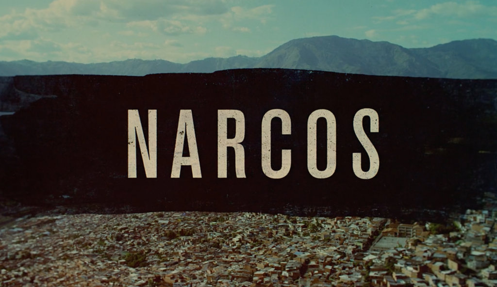
Like all effective title sequences, the title sequence for Narcos contains the essence of the entire show. Themes of greed, excess, absurdity — even the narrative arc — can all be found here, if you look closely enough. “When you make a main title sequence for a show, your goal is to distill an entire season’s worth of themes, stories, and ideas into a very short sequence,” director of photography/editor Nik Kleverov told us. “You have to look at every shot. You can’t do things ‘just because.’ Everything needs a purpose.”
We asked Nik to break down his work for us, beat by beat, to reveal what’s really going on in this beautifully executed, deeply layered title sequence.
Here’s Nik.
0:00 – 0:16
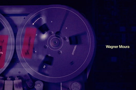
Nik Kleverov: These first 16 seconds, with the exception of the map shot, are all elements we shot ourselves. So anything that’s not archival is something I shot. But hopefully the difference shouldn’t be obvious. Everything we did — from the way we lit the scenes to the way we treated the footage — is meant to blur the lines between what’s archival and what’s not.
Filmsupply: So this reel-to-reel tape recorder is something you shot?
Yep. We put that cool orange tape on one of the reels to give it this archival look — we literally made this look like a reel used for archiving. That’s an old Nagra reel-to-reel, I believe. We rented a bunch of different machines to find one that looked just right.
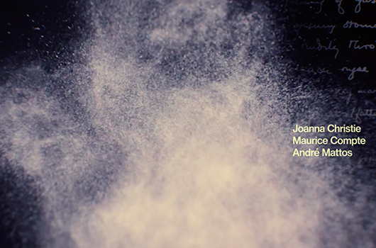
The map wasn’t something we shot. That’s satellite imagery. But there’s a lot of treatment on top of it. I can’t take credit for those pulsating reds in the blacks. That was the art director. But I really love that touch. Everything in this sequence is meant to have the quality of a journal or notebook, which we establish here and continue throughout. Another thing we establish here is the sliding theme, right at the nine-second mark. You’ll see that happen several more times where the layers split, almost like a slide projector or someone examining microfilm. Then obviously we had a lot of fun here playing with cocaine.
Filmsupply: What’s the cocaine?
It’s mostly talcum powder, which is very responsive to sound and vibrations. It has a very amorphous kind of texture. But depending on the shot, we added flour and baking soda as well. In the end, it became our own concoction, which took a lot of experimentation to nail down. We wanted something that breathed, moved, and danced just right.
0:16 – 0:27
This plane footage is archival. We looked through countless hours of footage to find this. The issue was that a lot of footage like this from back in the day exists only in commercials produced by the airlines. When we finally found a clip we liked and could use, they were like, “Well, okay, but you can’t show the people.” They were all actors, and we would have had to find out who they were and track them down and pay them, which would be impossible. So part of our creative solution was to lean into the theme of surveillance and the whole narco drug world, and just cross them all out. It’s funny because that’s something a lot of people like about this shot, but it was done out of pure necessity.
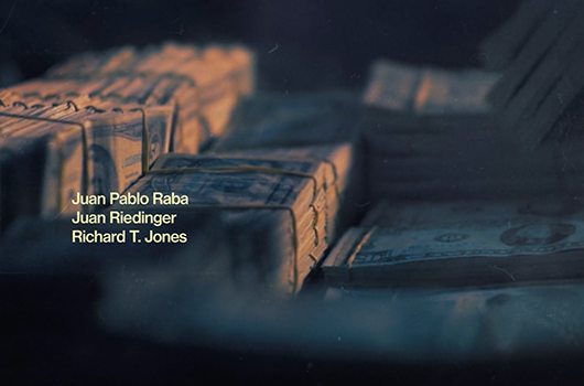
Next, the white gloves of an airplane security officer are seizing bags of cocaine. Then a diagram of how the coke is laid out in the bag. A lot of the magic here is in the overlays, which, again, I can’t take credit for. But that really dresses up the sequence nicely. Then we do this match cut where the cocaine turns into dollar bills. We actually rented really old bills, which was fun.
Filmsupply: It’s amazing how much stuff you miss when you’re not looking for it. The match cut between the cocaine and the money is emblematic of the whole show.
Totally. When you make a main title sequence for a show, your goal is to distill an entire season’s worth of themes, stories, and ideas into a very short sequence. So you have to look at every shot. You can’t do things “just because.” Everything needs a purpose.
0:27 – 0:30
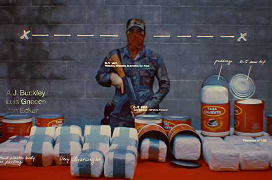
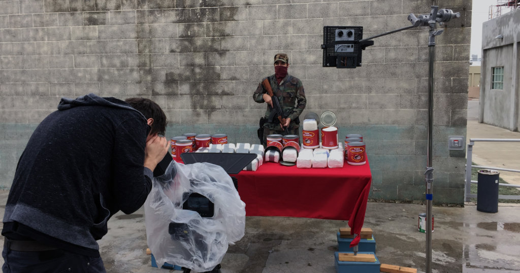
At 27 seconds, we see a soldier with all the seized bricks. This was a re-creation of a photograph we liked but nobody knew where it came from. The image was so striking that we decided to make it ourselves. It was fun. We did a lot of variances as to where the soldier walked in, where he did various actions. Ultimately, the strongest choice was the simplest: having him stand there almost like a photograph. But if you look closely, you’ll see it’s actually film.
0:30 – 0:34
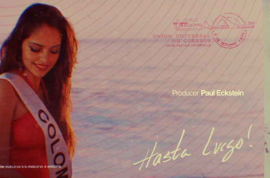
Then we go to Miss Colombia, which we shot in Santa Monica. The big point of contention here was the postcard treatment. There was a lot of discussion about it, about what details should be included. You can see the stamp says Bogota, and it also carries through the plane motif we’d established earlier. There’s a lot of eye candy for people to tear apart if they want. And ultimately we felt like all these little details made it feel more authentic.
0:34 – 0:40
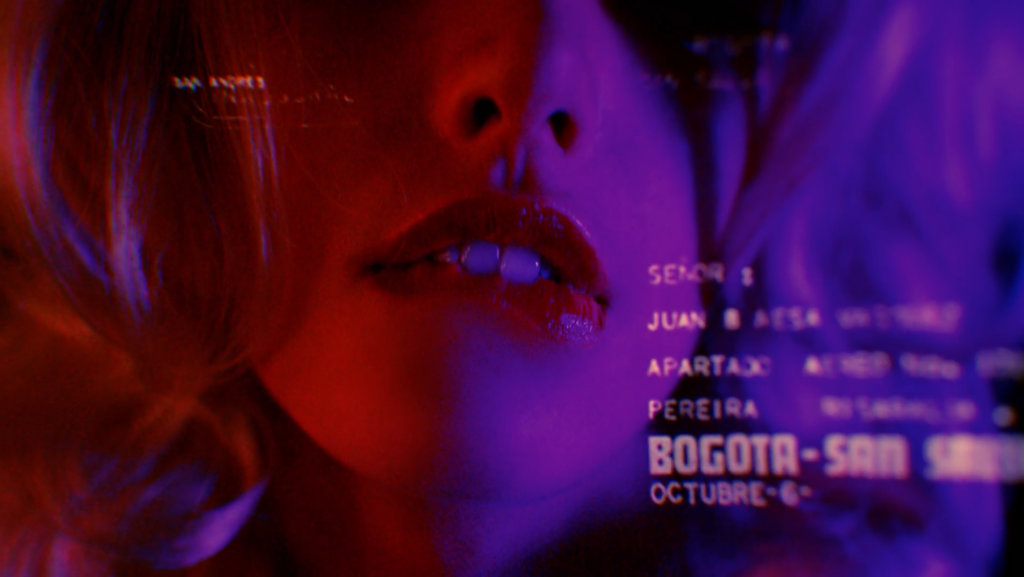
Here we wanted to show the allure and benefits of being one of these drug lords. We had a few people come in, and we played around with some options — necklaces and things. But we settled on these lips, which really evoke the desire associated with this kind of life.
Filmsupply: There’s definitely a psychological progression here: cocaine turning into money, money turning into excess, and the excess ultimately turning into violence by the end of the sequence.
It’s so important to have that deeper level behind an edit. Otherwise you’re just making a montage. Even if what you’re doing is so subtle that it comes across only to you, you should know that you’ve created something with intention.
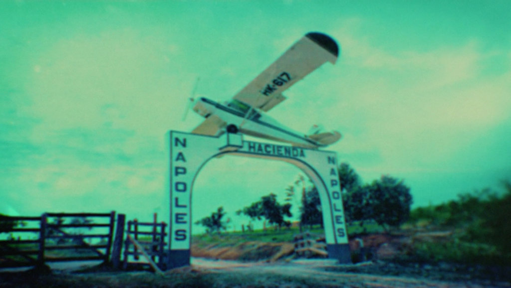
0:40 – 0:54
This is the Hacienda Nápoles where Pablo Escobar lived. It’s archival; however, we added some 3D to it, gave it some camera movement to make it feel like footage. We put a lot of work into that shot. You might wonder if it was worth it. The answer is yes. This shot is so important in establishing where we are and when we are. It gives it a realness. We even added a bit of handheld movement in there. It’s super subtle, but it makes it feel very authentic.
Then the scenes that follow exemplify the decadence of this lifestyle. We went through so many rounds trying to find just the right images, the right rhythm, ultimately leading up to real archival shots of cocaine. We wanted to give a glimpse into how it all worked. And all of this leads us into our next section of the sequence that begins at :54.
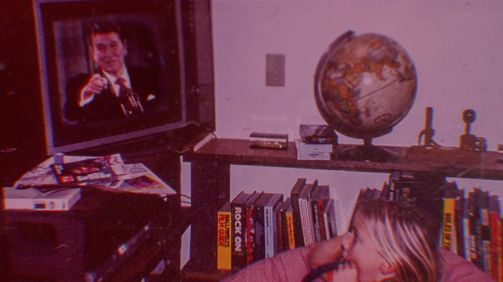
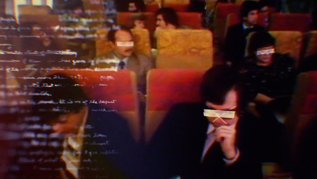
0:54 – 1:21
Here you see a family in America watching all of this. We’re starting to tease the war on drugs that’s coming. Then you’ll notice in this next aerial shot that we bring back the grid, which ties back to the very first shot in the sequence. These aerial images were shot for the show. They have a great team who did a ton of beautiful work, so we took what they’d done and treated it to match our sequence.
At 1:03 there’s obviously a very powerful shot of a murder victim. We found this photograph in one of the books we read for research, and we fell in love with it. We wanted to start adding moments that made people feel slightly uncomfortable. It’s all been fun and games up until now. Suddenly this becomes real and it’s gruesome. This one shot ads a nice gravity and weight to the entire sequence, followed by more archival footage of tanks and violence taken from The Palace of Justice siege where they set fire to the records so they couldn’t be incriminated.
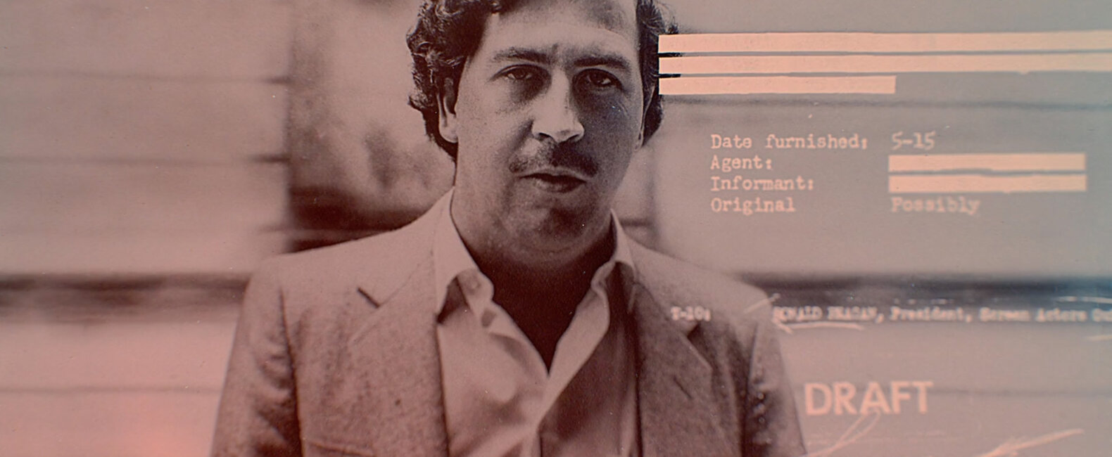
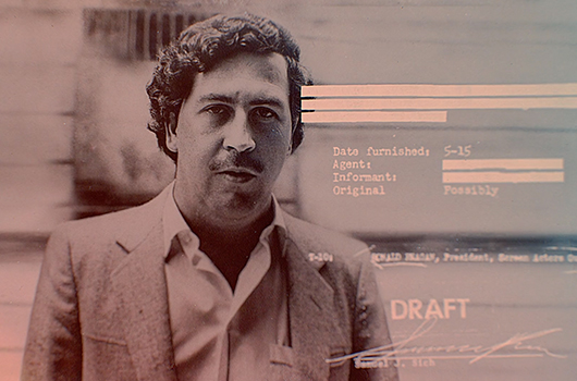
The photo of Pablo at 1:10 is real, and we brought back the redacted information motif that we’d used with the passengers on the plane.
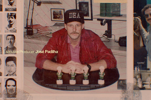
And obviously the photo at 1:13 of the DEA agent is real too. He’s sitting at a desk with bobbleheads, which I think gives the whole piece a touch of humor, even though it’s all very dark. It adds to the absurdity.
And then we finally have the title treatment, which is built off the idea of redacting information.
1:21 – End
The final shot is something we went back and forth about a lot. This image is from the show, so unfortunately we didn’t get to blow up a car ourselves. But the footage we got was a lot tighter, so we ended up having to re-create a lot of the smoke and flame elements in order to get a wider shot. And just symbolically, the car is indicative of the doom that’s coming, the price that has to be paid, the true cost of this lifestyle.
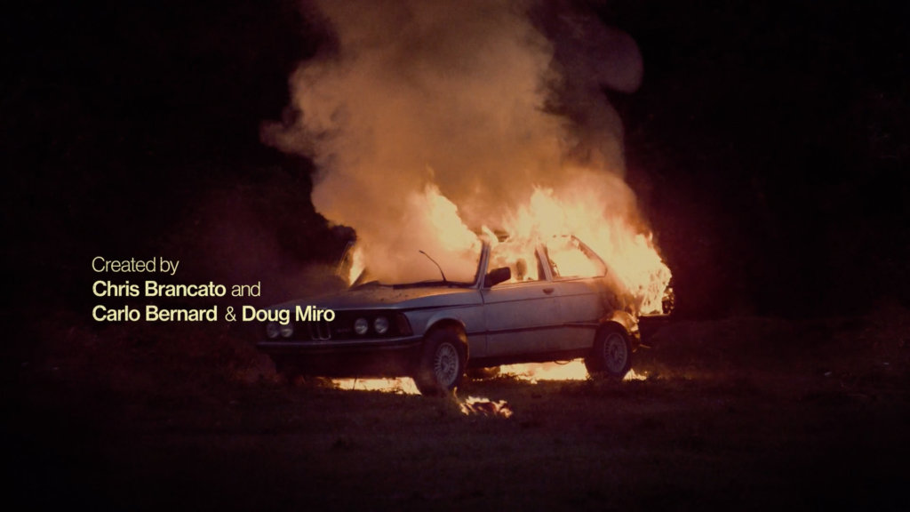
We had other options for the last shot; but we really pushed for this one, and we’re happy they went for it. That’s what’s interesting about making a main title. It’s one of the true intersections of art and commerce. There aren’t a lot of other places in the business world where you can make art.